
Next Level Parking
Overview
This project involved designing a responsive website and mobile app to help users find, dispute, and pay parking tickets. The goal was to simplify the often frustrating experience of managing parking violations, providing a user-friendly solution that works seamlessly across devices.
Problem
Managing parking tickets is a source of stress for many users, often due to confusing systems, unclear dispute processes, and outdated payment options. Users needed a more intuitive platform to resolve these issues efficiently.
Solution
By creating a platform that integrates search, dispute, and payment functionalities, the entire parking ticket management process has been streamlined. The design emphasizes clarity, accessibility, and efficiency to meet users' needs.
Project Role
Lead UX Designer, UX Researcher
Prompt
Design a responsive website and mobile app for people to find, dispute, and pay their parking tickets.
Project Timeline
December 9, 2024 - December 31, 2024
Tools
Figma
Link to Figma Prototypes
Features
-
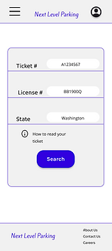
Ticket Search: A simple interface for locating parking tickets using license plate or ticket numbers.
-
Dispute Management: Step-by-step guidance for submitting disputes with attachment uploads and explanations.
-
Payment Options: Secure payment methods, including credit card, bank transfer, and digital wallets all located under Saved Payment Information in Account.
-
Reminders & Alerts: Notifications to prevent missed deadlines for payment or dispute submission.
-
Pass Purchase Options: Various parking passes based on time duration with scalable pricing.
Design Process
The process began with user research to uncover pain points and preferences. I then ideated solutions, created wireframes and prototypes, conducted usability testing, and iterated based on user feedback. The final design is both responsive and intuitive.
Patterns & Insights
Research revealed users prioritized dispute clarity and trusted secure payment systems. Patterns showed many users wanted visual confirmation of their ticket details before taking action. Seeing the length of the dispute process, as well as, notifications to make a payment were revealed to ease anxiety. These insights influenced the decision to add a visual ticket summary for review, notifications, and progress indicators.
Desktop Key Screens
With Account


Without Account


Dispute Ticket


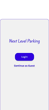
Mobile App Key Screens


Outcome
The final product is a responsive web and mobile app prototype tested by users, showing confident task completion and positive feedback on ease of use and design aesthetics.
Reflection
This project reinforced the importance of understanding user emotions in addition to their functional needs. While the technical aspects of finding, disputing, and paying tickets were straightforward, addressing the stress and frustration users experience was equally critical. I learned how small design details—such as progress indicators and clear language—can significantly improve user confidence.
If I could revisit this project, I would conduct a longer testing phase to ensure the app meets diverse accessibility standards.